Under
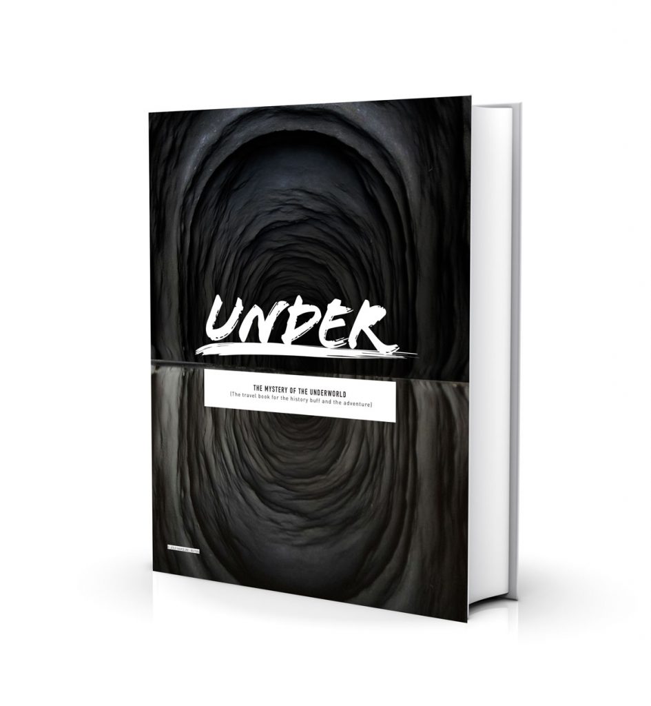
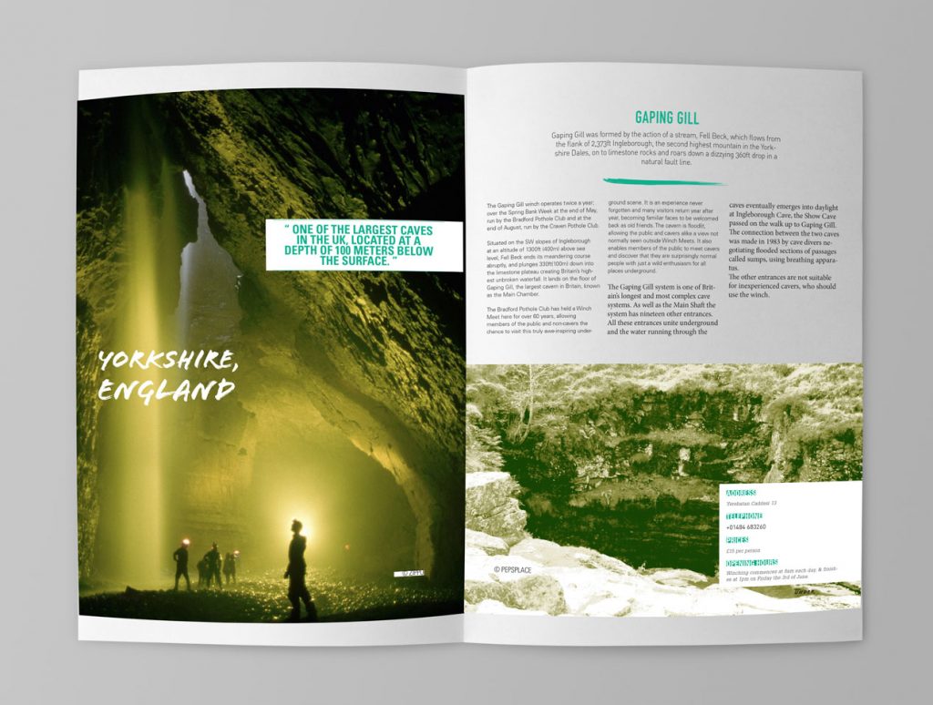
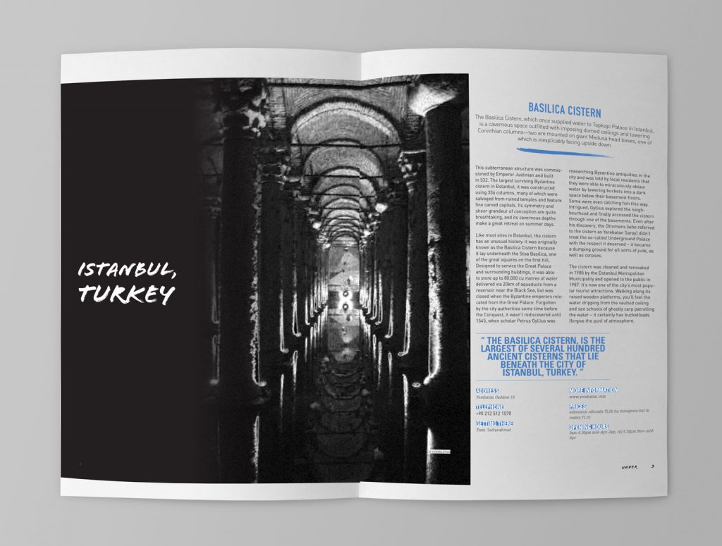
“Under” is a history of mystery underworld photo book that brings the audience back to the memories of those places. The book is a history guide for the history buff who is looking for a place to travel in the theme of underground. There are many kinds of the underground in different countries that waiting for the adventure to explore how deep of it can be. The design target for young people who want to find some mystery places for challenging them self to go there. The design using dark tone to bring a sense of mystery but also using pop-up color for some elements for catching the eyes.
Kings House
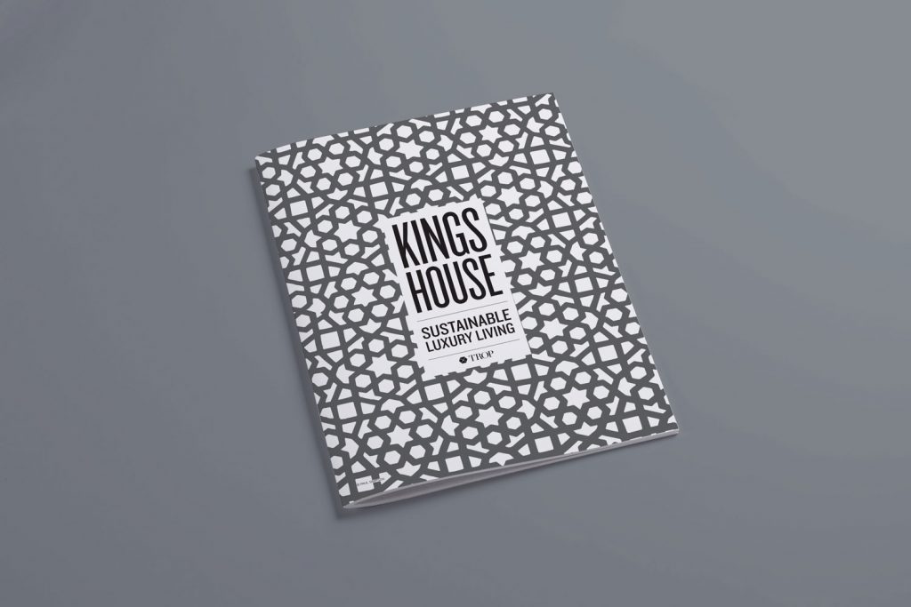
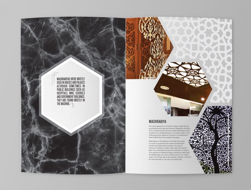
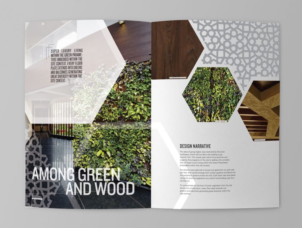
Trop is a real estate developer in India located in the heart of Bangalore offering high-end apartments. The concept combines Indian and Middle Eastern styles in a contemporary approach. The design element uses Mashrabiya, resembling the Indian Jaalis, for the main idea of design. The architecture has a bioclimatic design: the concept is “sustainable” with the building’s concern in energy and environment. With these concepts, the brochure focuses on the Indian pattern and nature to represent the product. Besides using san serif typeface, the clear layout with less type help the brochures look more high-end, which matches the customers who have a modern life style, while they preserve the old culture and environment.
Healthy Times
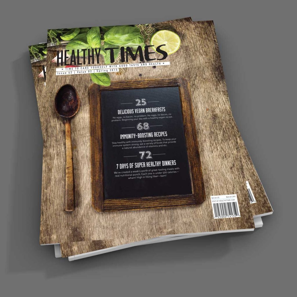
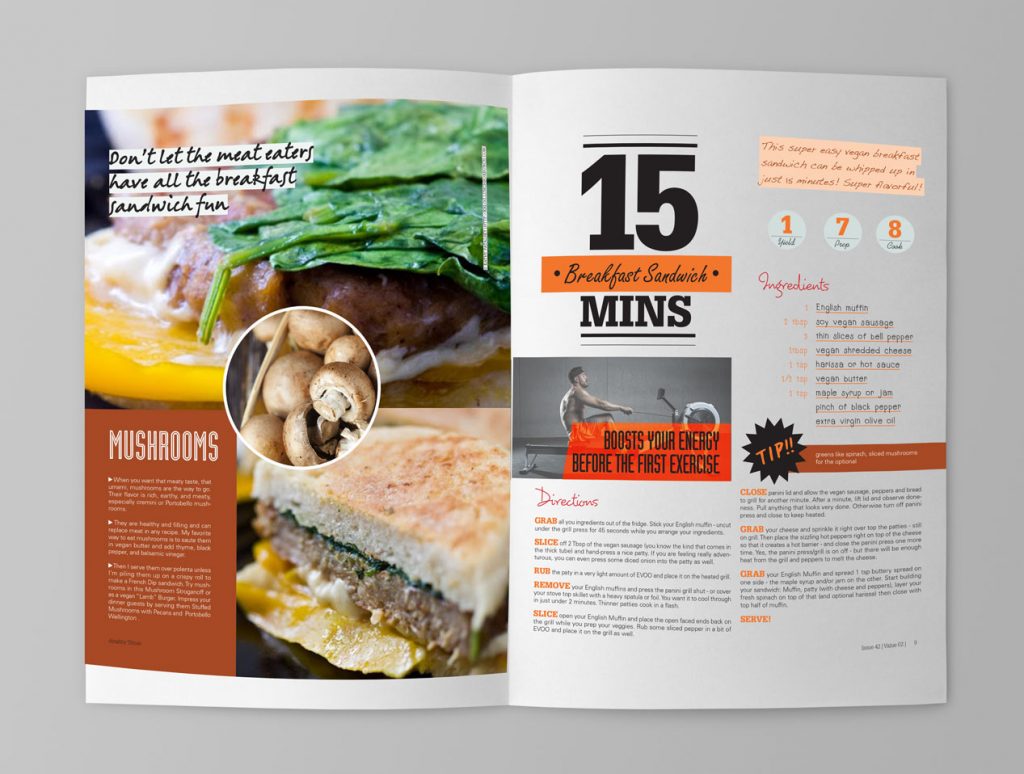
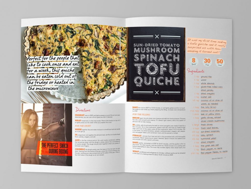
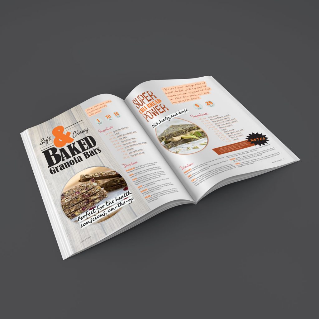
Healthy Times is a magazine for healthy people who take care of their health from eating to exercise. There are menus in the magazine that give you ideas of vegan food for breakfast to dinner, and the exercise tips that will help people stay in healthy. The concept “healthy” is reinforced with the thin, and the chalkboard and playful hand done idea will keep the audience captivated, like they are having about the secret recipe. The idea of having different typefaces in different menu is to make them more interesting in terms of taste. The hand writing in the menu part is the “homemade” idea that is related to the concept of being healthy and saving money by home cooking.
