Osaka
The city of Osaka is the economic powerhouse of the Kansai region, is the cultural and historical heart of Japan. It combines old cultures and new cultures in the same place. Osaka was formerly known as Naniwa, which was once Japan’s capital city. In the 16th century, Toyotomi Hideyoshi chose Osaka as the location for his castle and the city may have become Japan’s capital at that time.
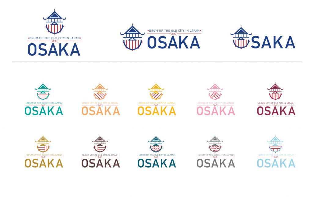
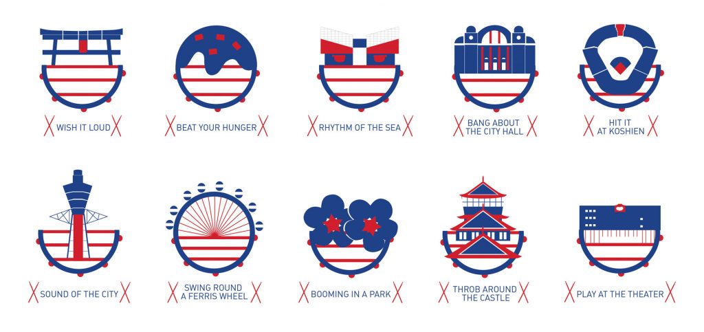
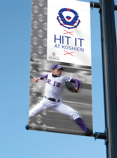
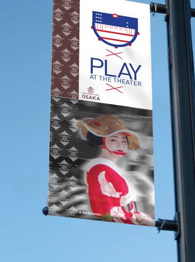
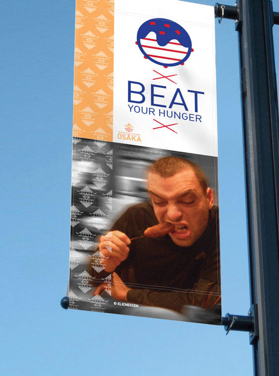
The logo combines with 2 well known of Osaka symbols: there are the Osaka castle and a drum from Kuidaore Osaka and inside the drum; there are the vibration of rhythms that will change along with each logo. The concept is reconnecting the old city. And there are the icons that will help the city promote the products and tourism along with the main logos that the icons also come along with the logo idea about the drum that can bring the things up to show and ask for some attention.
Splash
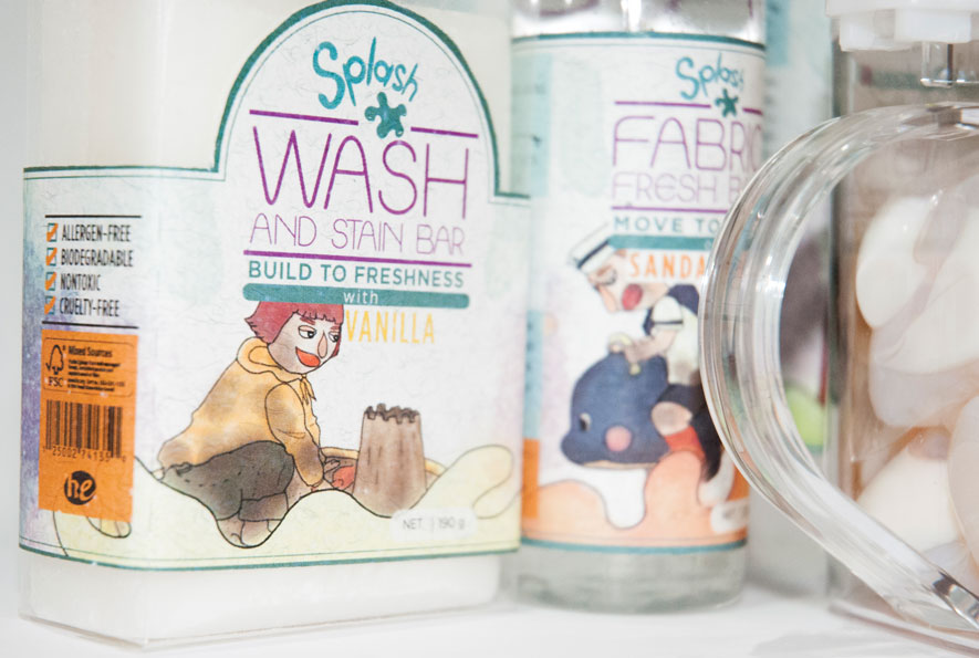
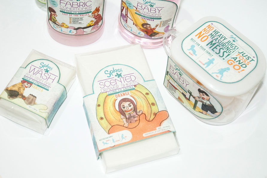
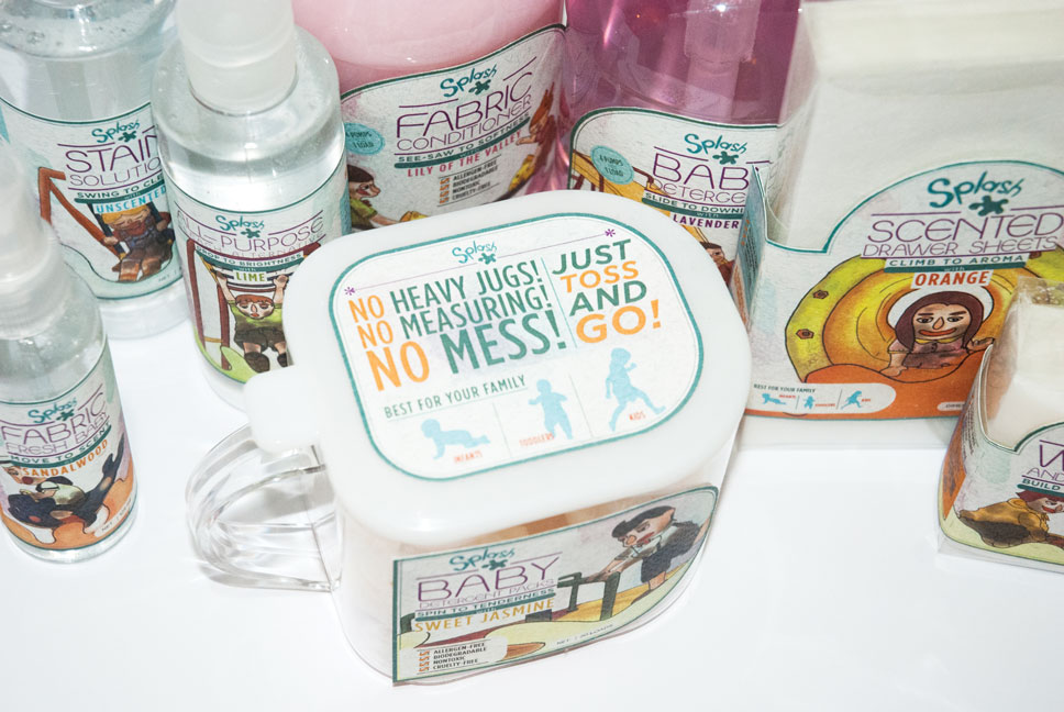
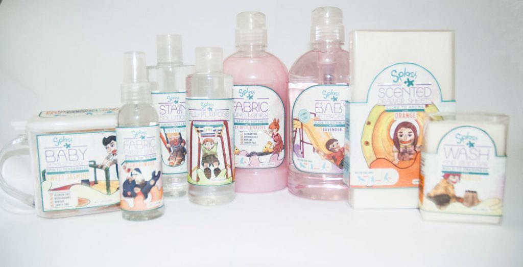
Splash is a laundry product for babies, which use eco-friendly ingredients suitable for the sensitive skin. The products aim at kids who have lots of stains in their clothes from playing all day. Splash will help with the housework, with the concept of “playing with no worries”. The illustrations are straightforward and using the theme of kids playing in a playground. Each one will be on a different equipment and each product will be suitable for different scenarios. The element watercolor background is similar to the products splash and will help the messy kid get clean
after use.
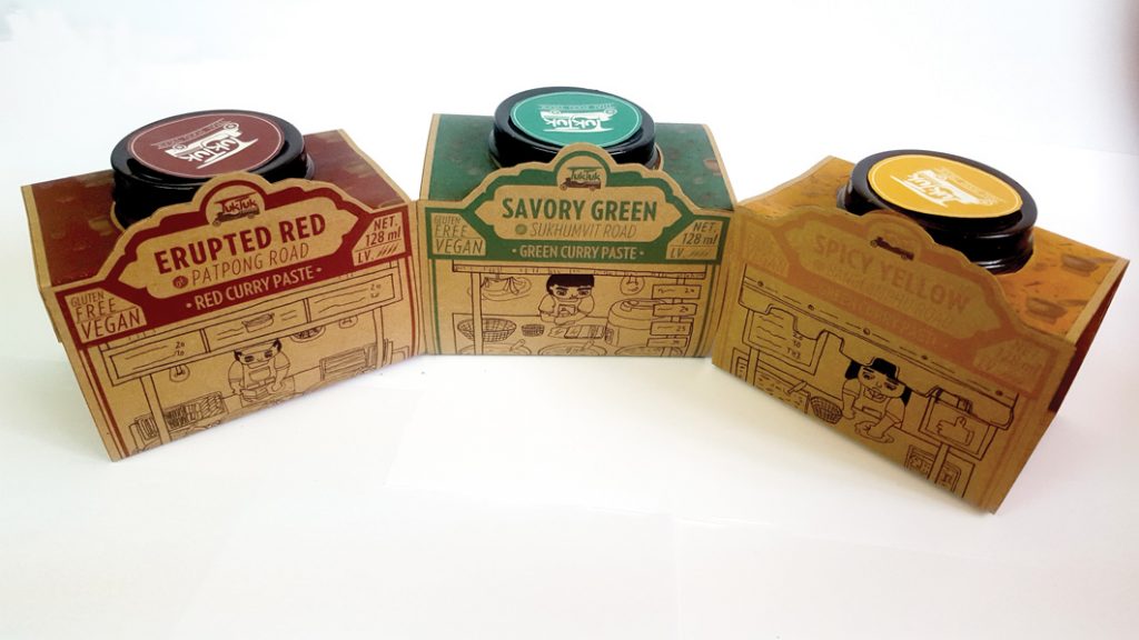
Tuk Tuk
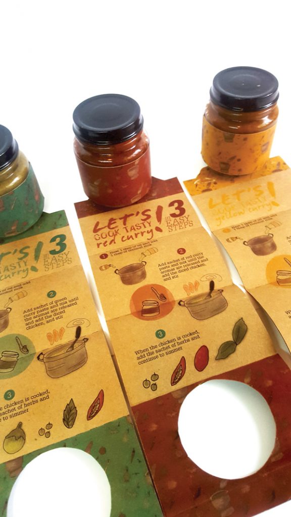
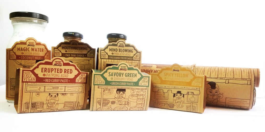
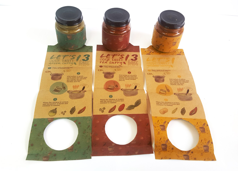
Tuk-Tuk is a Thai food truck that located on Robson street. The idea of the store that come from a famous street food in Thailand, the land of food is everywhere. This is a starter kit for who want to cook an amazing taste of Thai food. There are including a famous menu for who love Thai food. The labels of the product using different of drawing characters with street stalls and the inside of the label also showing an easy instruction in a short step that easily for following for everyone. All of the product come from a secret recipe for chili pastes and sauces that mean the customers will get a fresh homemade product for their kit, so the design using a brown paper of giving the sense of sustainable and homemade.
